
Nezâket Mahâl. Restaurant/Cafe
Decor, Wall Art & Shop Sign
Full-wall artwork for the restaurant’s bathrooms, with mirrors built into a binocular-inspired design. They sent me a high-quality image, but it didn’t quite fit the planned mirror placements. I used Adobe Firefly to adjust the image to the required sizes, then made some manual retouches to get everything looking right and make sure the final design worked with the space.


Packaging
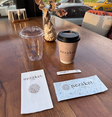
I designed all the branded items for the restaurant, from napkins, cups, sugar packets and wet wipes to takeaway boxes.
I made sure everything followed the same visual style and felt consistent with the overall brand identity. Once everything was finalised, I prepared the print-ready files and sent them off for production.

Menu
The menu needed to be clear and easy for everyone to read, so I kept the layout as minimal as possible, with a clear hierarchy and a consistent visual style. To tie it in with the restaurant’s interior, I also used the recreated tile patterns as a supporting design element. I made sure the layout could be adapted to different sizes and formats, so it worked just as well for printed menus as it did for digital displays.


Pattern
The owners really wanted to bring the tile patterns into the brand identity since we were creating the brand around the interior. There were lots of different designs to choose from, so we explored the
options and narrowed them down to four tiles. I then recreated them digitally by
tracing the original designs and adding the necessary details. This made it
easier to use the patterns across different brand materials while keeping them
consistent with the restaurant’s interior.


Logo & Colours
After a few meetings with the owners, we had a clearer idea of what they wanted for the brand identity. They preferred a minimal logo with a serif typeface as the main focus, supported by a hydrangea flower icon, which is the favourite flower of one of the co-owners. The aim was to keep the identity simple, elegant, and timeless, while adding a personal touch through the flower.
The colour palette was based on brown and greyish blue, inspired by the tiles the owners had chosen for the restaurant. I wanted the colours to work well with the interior and create a consistent look between the space and the overall brand identity.


The idea for the restaurant came together quite quickly in May, with the grand opening planned for July, so we had a limited amount of time to get everything ready. The owners are family friends of mine and my best friend, so I took on the entire design process to help them.
They had already decided on a Balkan restaurant and café concept, so the overall theme was set from the beginning. The interior decoration was also underway before we started working on the branding, which meant the visual identity had to be built around the space rather than the other way around.
We used the interior, colours, and tile designs as our starting point to create a brand identity that felt connected to the restaurant.
